
Goal: Learn how using components in Gluu standardizes links, texts and embeds across work instructions so you update once and reuse everywhere.
Components are reusable building blocks that can be used inside work instructions.
Before you start #
- Plan: Reusable components require the Advanced plan.
- Role: All users can see components in work instructions. Only users with the Manage components permission can create or update components.
- Setup: No special setup—all Gluu objects (processes, activities, tasks, forms, etc.) are auto-converted to components when created.
Why use them? #
Components speed up work and keep content consistent. Update a component once and every work instruction that includes it updates automatically.
Think of components as a toolbox: standardize legal text, links, vocabulary and system descriptions across instructions to save time and avoid errors.
All Gluu objects (processes, activities, tasks, forms, etc.) are auto-converted to components when created. You can also create your own.
Video intro #
If you prefer a video, watch the quick guide below.
Create component types #
Use types to categorize components (e.g., General internal links, Competency, Vocabulary, Business application, Legal texts, Reference documents, External links, SharePoint sites).
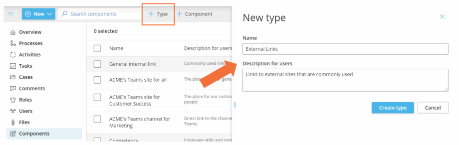
To create a new component type:
- Open Components and turn on Edit mode.
- Click Add Type.
- Enter Name and Description.
- Click Create type.
You’re done once the new component type is saved and available when creating components.
Create a new component #
There are three component types you can create:
- Link component — share internal/external links (optionally show link text instead of the URL).
- Text component — reuse standard texts (e.g., company or system names).
- HTML component — combine videos, links, text and images. You can also convert an entire work instruction (or part of it) into an HTML component.
To create a text, link or HTML component:
- Open Components and turn on Edit mode.
- Click Add Component.
- Choose the Component type.
- Name the component.
- Add a short description.
- Choose which Category it should show for (specific or any).
- Set link behavior (show as link text or full link).
- Choose the layout.
- Apply styling.
- Click Create Component.
You’re done once the component is saved and appears in the component list.

TIP! In an HTML component, quickly link to other components with AltGr + 2 to use components as building blocks.
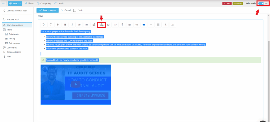
You can also create a component directly from a work instruction
- Open the work instruction and turn on Edit mode.
- Select the part to include (text, videos, files and images are supported).
- Click the Create component icon above the instruction.
- Edit details in the pop-up and save.
You’re done once the new component is saved—it’s now available to insert into other work instructions.
Sort the component overview #
Sort A–Z or Z–A by clicking the Name column.

You can also filter the list (see advanced filtering guides for components on the components overview page).
TIP! The Explorer is great for a visual overview of how components connect to activities and processes.
Mark a component as a system to show its icon #
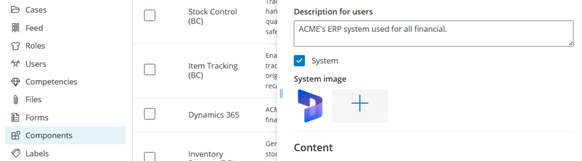
You can mark any component as a System to represent a business application or IT system used in your processes. System components get their own icon, which appears everywhere the component is used — in work instructions, activity overviews, and process diagrams.
How to mark a component as a system and upload an icon #
- Open the component and turn on Edit mode.
- Enable the System toggle.
- Click Upload icon and select an image (e.g., the system’s logo).
- Save the component.
You’re done once the icon is saved—it now shows wherever the component is used.
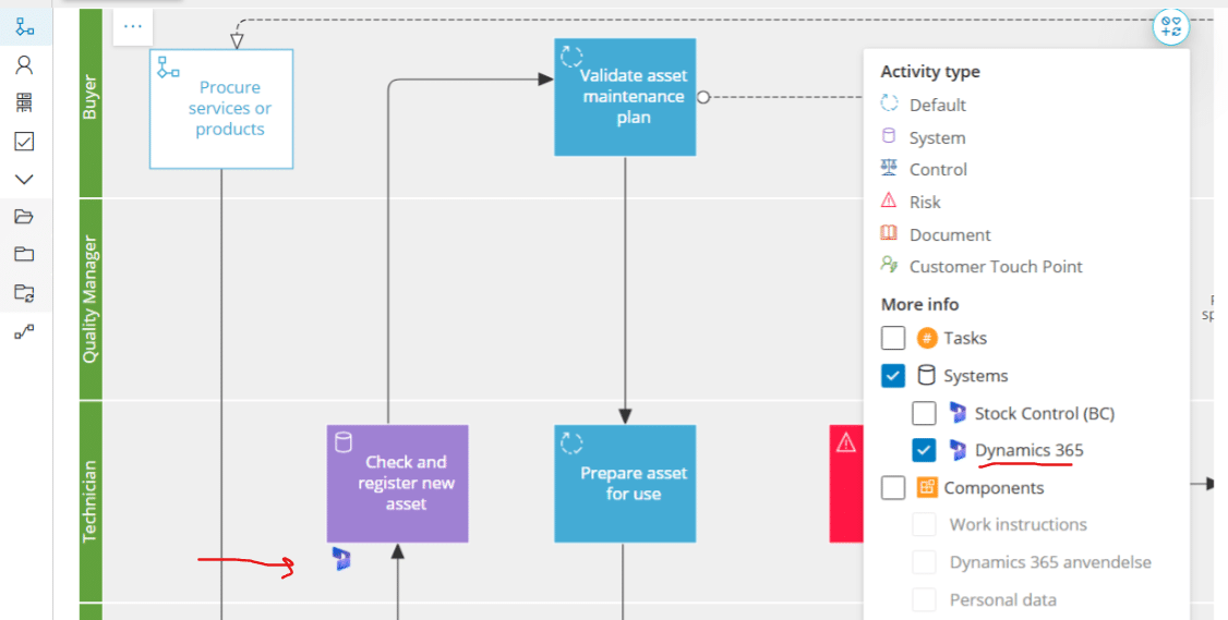
The icon is shown wherever the component appears, making it easy to spot which systems are involved in a given activity or process:
See which activities use a system — on the diagram #
On the Diagram page you can filter by system to get a visual overview of exactly which activities a specific system is used in. This makes it easy to assess the impact of system changes or document system dependencies across your processes.
- Open the process diagram.
- Click the Filter option and select a system.
- Activities using that system are highlighted in the diagram.
Add to work instructions #
To insert a component into a work instruction:
- Open the activity and turn on Edit mode.
- Place your cursor where the component should go.
- Click the Component icon in the editor (or press AltGr + 2).
- Browse by type or search by name.
- Click the component to insert it.
You’re done once the component is inserted at your cursor.

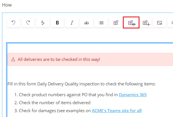
Inserted HTML components show as named boxes in edit mode. Click the component icon with the “eye” to toggle between box view and content view.
Block view #

Content view #
FAQ – Using shared components #
Reusable components require the Advanced plan. On Core and Essential, work instructions can still include links, files and embedded videos directly, but the reusable component library is not available.
Any user can see and insert existing components into a work instruction they can edit. Only users with the Manage components permission can create new components or update existing ones.
A link component shares an internal or external URL, optionally showing custom link text. A text component reuses a standard piece of text, such as a company or system name. An HTML component combines text, links, images and video into one reusable block, and can even be created from part of an existing work instruction.
Yes. Processes, activities, tasks, forms and other Gluu objects are auto-converted to components when created, so you can always link to them from a work instruction. You can also create your own link, text and HTML components on top of these.
Marking a component as a System lets you upload an icon representing a business application or IT system. The icon then appears wherever that component is used—in work instructions, activity overviews and process diagrams—making it easy to spot which systems are involved in a process at a glance.
Every work instruction that includes the component updates automatically the next time it is viewed. This is the main benefit of components: you edit the source once—a legal text, a system name, a shared link—instead of hunting down and updating every instruction that references it.


